For a watch brand that has a long and illustrious history based on their ability to create timepieces that are perfectly suited and useful for pilots and aviation enthusiasts Breitling do have an unerring knack of creating fantastic Diver’s watches.
The history of the Breitling Diver’s watch started in the 1957 with the original SuperOcean. An instant classic that was successfully revamped recently as the SuperOcean Heritage. More of this beautifully realised homage and its ancestry can be found in my review of the SuperOcean Heritage Chronograph here:
Breitling SuperOcean Heritage Chrono “Green” | Andrew Michaels Jewellers
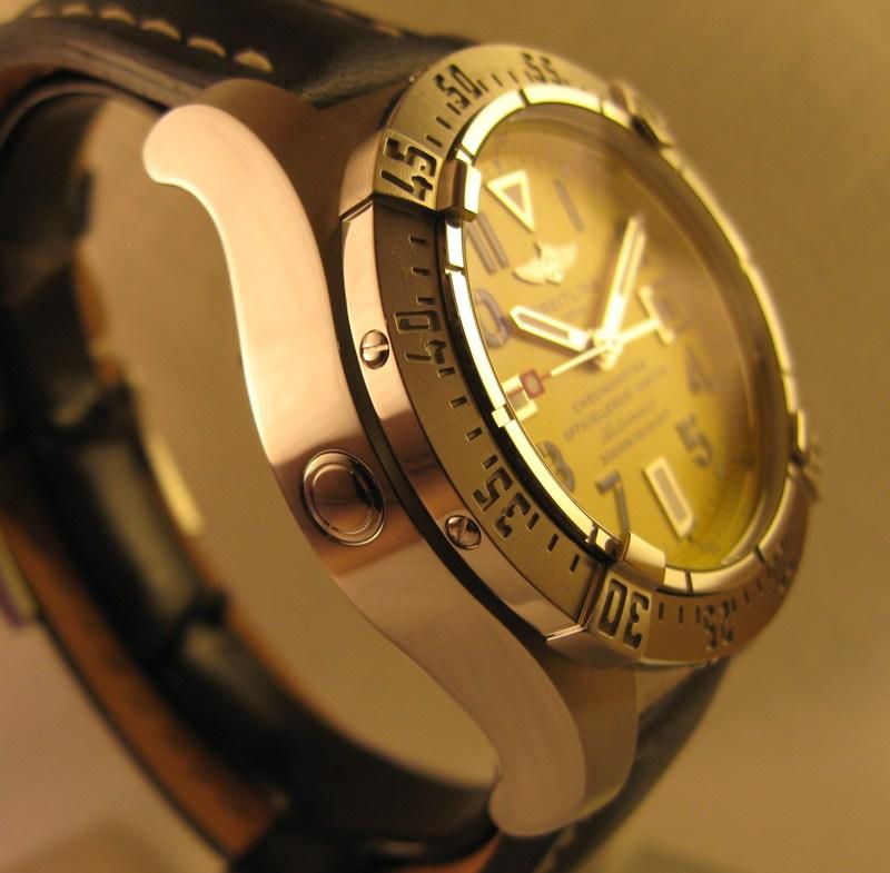
The SuperOcean Heritage line was reintroduced in 2007. Most recently and up until this point the Diver’s watches within Breitling catalogue included the 3000m Avenger SeaWolf in Titanium and then Stainless Steel, the 2000m SteelFish that is now a discontinued model constantly lamented by Breitling fans and the 1500m SuperOcean. To have a Diver’s watch within any high end manufacturer’s catalogue capable of withstanding the pressures of 1500m is as incredible as it is rare. However, to have further models in the line up that can dive a further 500m and 1500m is an outstanding achievement.

Witness me waxing lyrical about the outstanding feat that is 3000m water resistance when I review one of my all time favourite Diver’s watches here:
Breitling Seawolf – My Review | Andrew Michaels Jewellers
The SuperOcean line was dramatically updated in 2010 when a new 42mm model was introduced.
It has some wonderful design features that not only makes it aesthetically pleasing but also very legible, including oversized hands and Arabic numerals. The highly polished case was complimented by a brand new rubber inserted bezel and, most interestingly, there were five different colour variations available. Nothing new you may say because Breitling have always offered a selection of dial colours. This is not the case with the 2010 SuperOcean though. This model offers five different colour variations for the chapter ring and tip of the seconds hand. This was a clever move as it allowed the upmost legibility to be achieved throughout the range by maintaining a matt black dial with the aforementioned oversized hands and numerals. The colours available are white (my personal favourite), black, blue, red and Breitling’s corporate yellow. This timepiece was well received for all of the above reasons plus its very competitive price point. It seems the 2010 SuperOcean was the test bench for future models because there is now the 2011 SuperOcean. A little confusing to have two SuperOceans but I’m sure SO 42 and SO 44 will become common place nomencaltures in ADs and forums across the world.

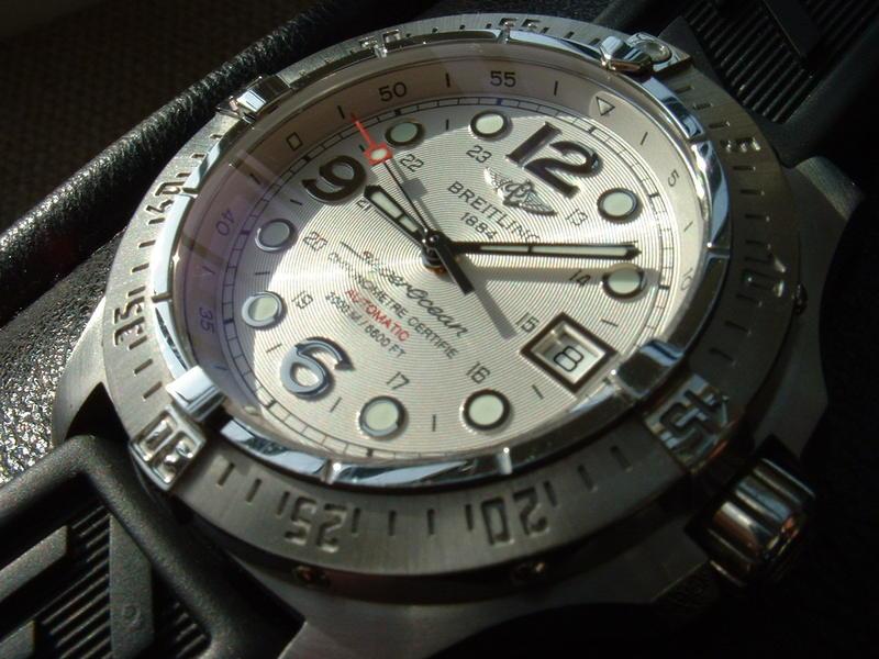
The main change in the design is the increase in diameter from 42mm to 44m. The case is also slightly thicker which, I am guessing, is to allow the increase in the water resistance from an already respectable 1500m to 2000m.

The dial has also had a slight makeover. When I first read of the 2011 SuperOcean my initial reaction was “Why?” The 2010 model is a fantastic timepiece. However, having since had time to think about this I think the fundamental reason was due to underwater and low-light legibility. The wonderfully realised new rubber bezel with brushed metal numerals and indices does not have a contingency for luminous markings.
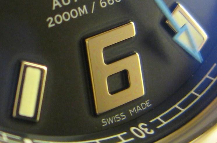
The dial had just three large luminous markings at 6, 9 and 12 O’clock, with smaller markings at the periphery of the dial. The new model addresses this issue (if it really is an issue) by now having applied Arabic numerals at 6 and 9 O’clock and large luminous markings at each other hour position. Please understand that this is solely the thoughts and hypotheses of the author.

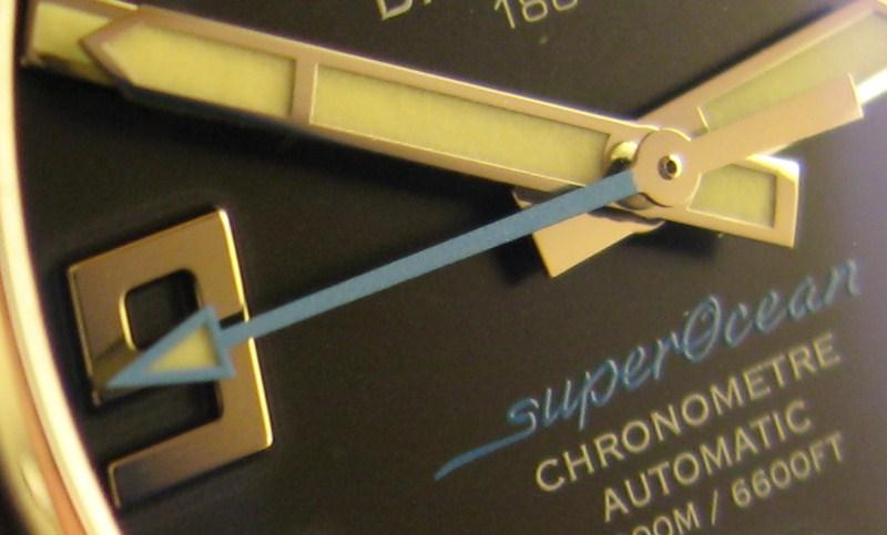
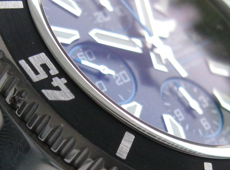
Another aesthetic change means that the seconds hand is now almost completely finished in the chosen colour instead of just the tip. This highlights the seconds hand further, in my opinion, especially on the new SuperOcean Chronograph which we will discover later in this article.
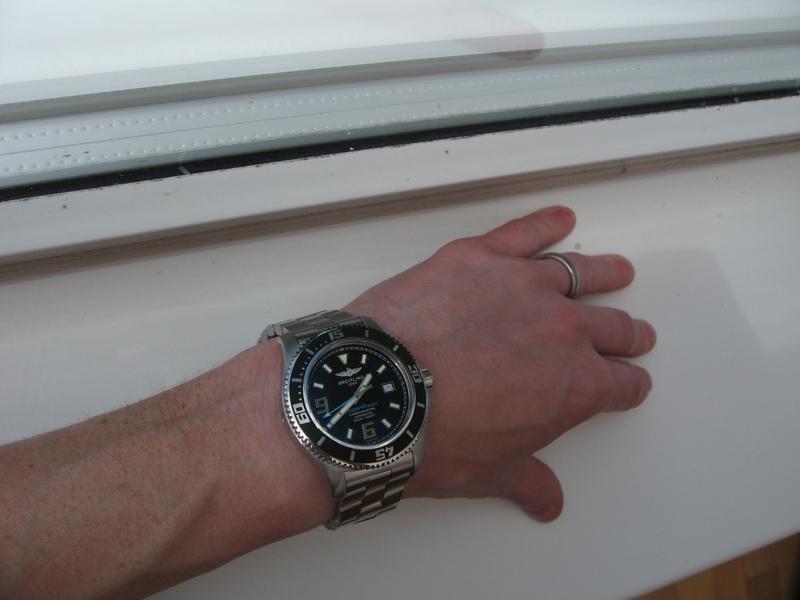
The overriding sensation of a great Diver’s watch is the feel of it. The new SuperOcean feels like a very robust, dependable and reliable timepiece.
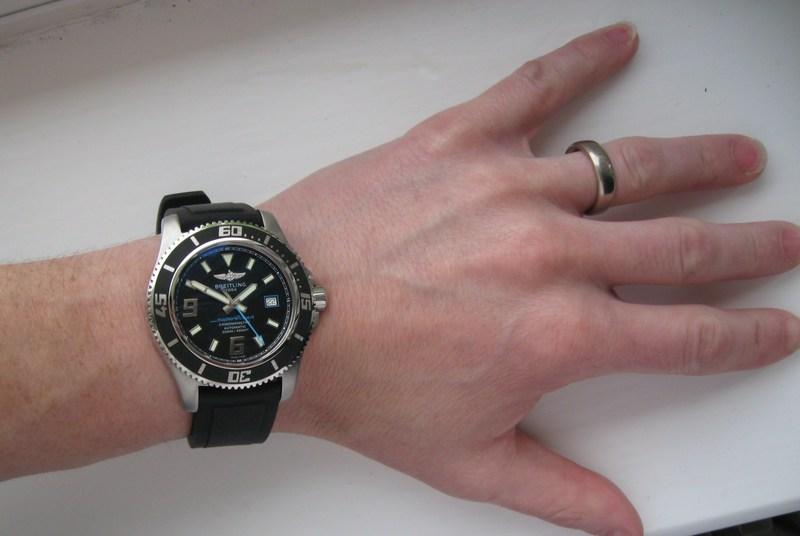
It has great presence on the wrist and yet is relatively comfortable. It is not overbearing or cumbersome, as can happen with oversized, fit-for-purpose tool watches. It is, actually, remarkably thin for a watch that can withstand 200 bar (or about 1.5 tonnes per square inch). The dimensions are non imposing.
The looks, to a greater extent, of a Diver’s watch are a given by the requirements that make up this type of timepiece. The addition of the rotating bezel, crown protection, high levels of legibility and case dimensions that allow for 2000m water resistance are major factors in the design. Therefore, just about anybody could design a Diver’s watch that does the job. However, Breitling have a long history of creating superb looking Diver’s watches and this all comes down to the small details and meticulous finishing.
Let’s check out the many details of this new 2000m diver’s watch:
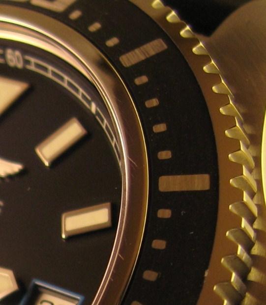
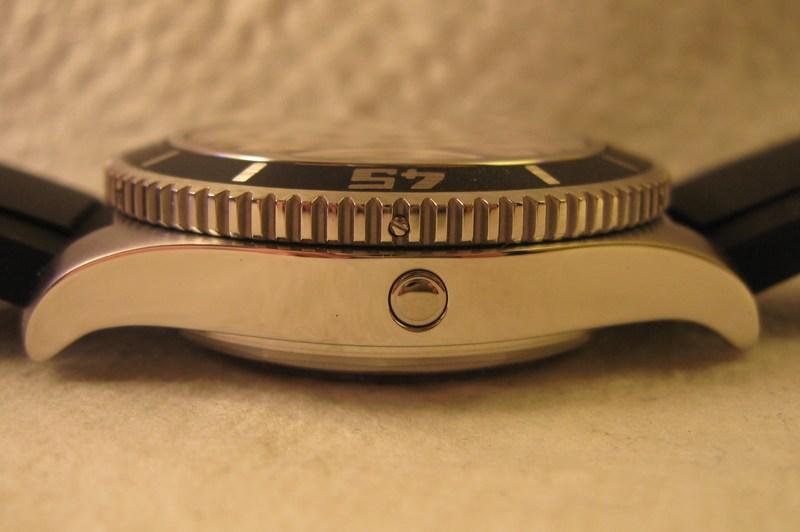
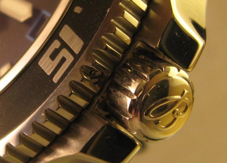
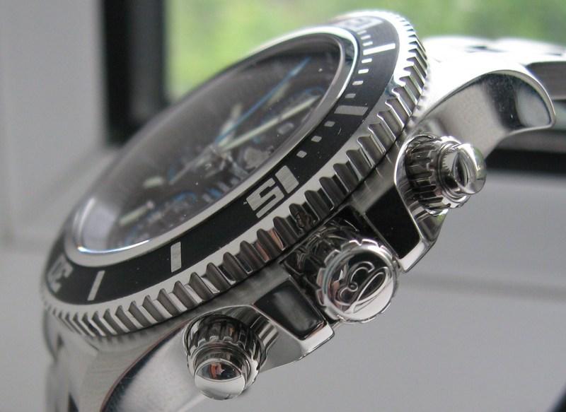
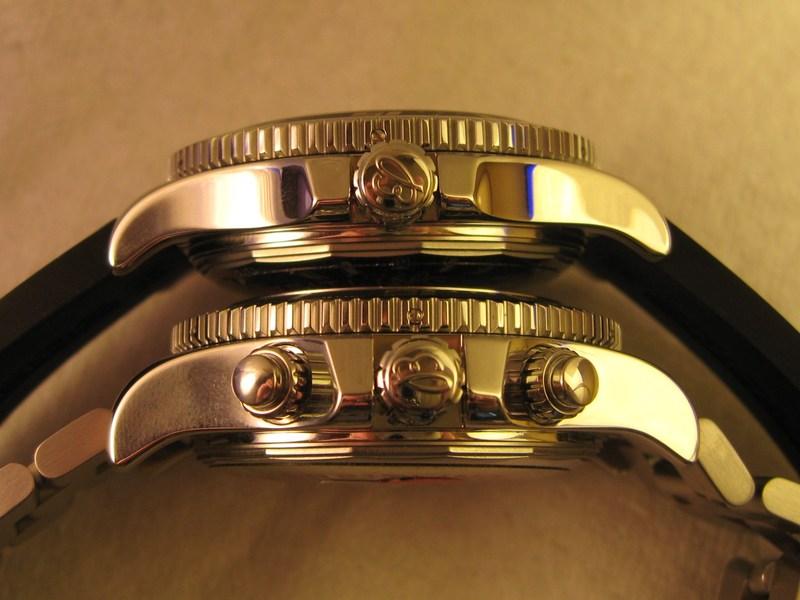
The bezel is meticulously crafted with its serrated edges that offer good levels of grip in all conditions, the rubber insert and the brushed metallic numbers and markers. It also has a solid feel when locking into each position with a nice audible click.
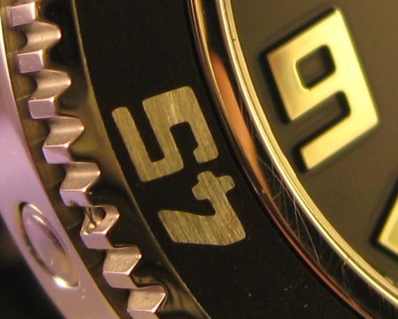
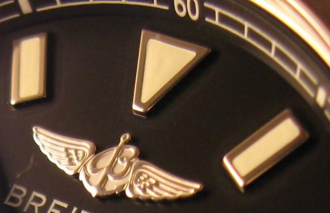
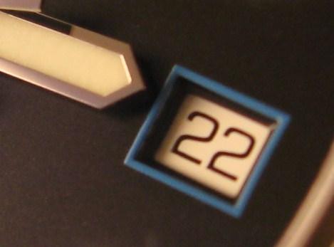
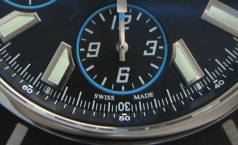
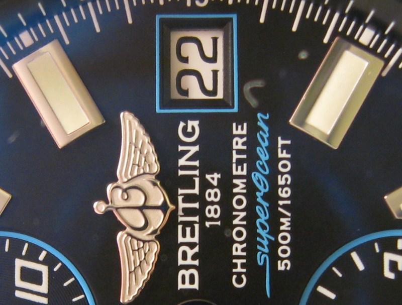
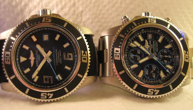
The dial details include applied hour markers for 6 and 9 O’clock, applied batons for the other hours, an applied Breitling logo and a date window that is accentuated by one of the five chosen colours.
So, is the new 2011 SuperOcean better than the 2010 model or is there no pecking order here? As a Diver’s watch it does just edge it, specifications wise, because of the extended depth and the greater low light legibility. For the rest of us non-professional divers, it’s simply nice to have the choice of these two great looking robust tool watches. The 2010 SuperOcean is the comfortable to wear for obvious reasons. Horses for courses, I suppose. It will be very interesting to see which model is most represented on the wrists of divers and forum members across the globe.
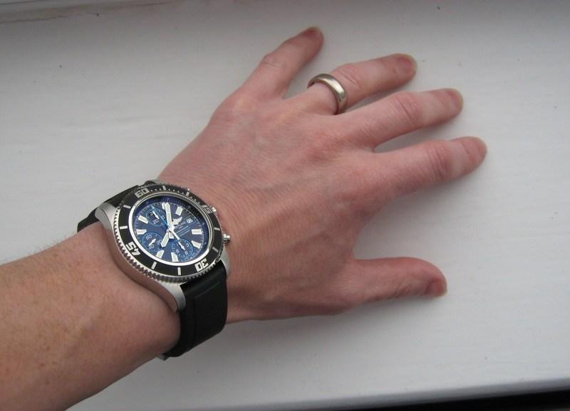
The other brand new model for 2011 in the SuperOcean line is the SuperOcean Chronograph. After the success of the 2010 SuperOcean Breitling has decided to incorporate many of the design features first introduced on this diver’s model into the chronograph version.
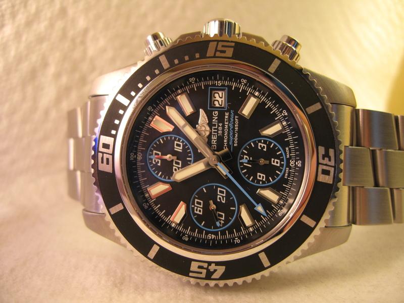
As with the SuperOcean the SuperOcean Chronograph has been in the Aeromarine family for a long time untouched. Utilising these new clever design features to bring the watch up to date has resulted in a totally different looking SuperOcean Chronograph.
The outgoing model was a great looking tool watch with tri-compax chronograph, day and date complications and a 42mm case. It also had screw down pushers to allow an admirable water resistance of 500m.
The new design features include wonderfully designed baton markers that encompass the subdials into their design, the very same coloured seconds hand and date window frame as the SuperOcean, colour edged subdials, colour tipped subdial hands, larger hour and minute hands, a diameter increase up to 44mm, a redesigned crown that is more comfortable to grip, the new rubber insert for the bezel. Which all come together to make a watch that is greater than the sum of its parts.


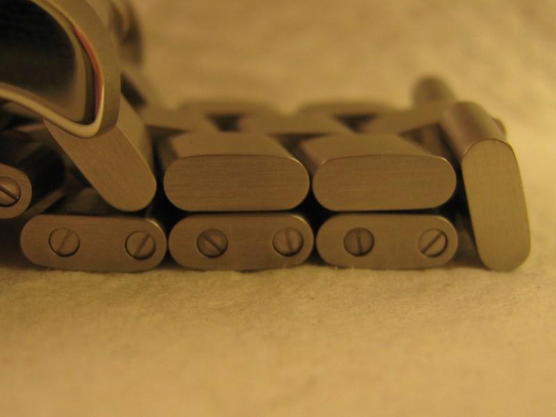
The outgoing SuperOcean Chronograph was a brilliant watch. This is reflected in the amount of time it remained in the Breitling catalogue. The new model, however, is a refreshing change. The choice of detail colour choices allows for a much greater depth to the range. The increase in size offers greater legibility and a much more substantial feel. The revamped bracelet is at once a thing of beauty and also a very dependable and reassuring design.
So, would I change anything on either of these new models? I do think the date displays on both watches are a bit of a letdown. On the SuperOcean I think that having a bolder window to the display would have worked. I appreciate the coloured detailing reflects the other similarly detailed aspects of the watch but it makes the date display seem a little lost on a dial that is full of standout design elements. The date window frame on the Avenger SeaWolf is a great example of this.
The original SuperOcean was differentiated from most sub-aqua chronographs on the market due to the inclusion of a day display. I would have liked to have seen this useful feature carried over to the new model.
Other than that, for the complications and features that they both provide for the money I cannot fault them. Some of the design details may not be to everyone’s tastes but that is a purely subjective stand point and most of those features are there for reasons of functionality.
Choosing between the SuperOcean and the SuperOcean Chronograph is an irrelevant task.
If you desire the chronograph complication you will be drawn to the latter model with it’s already real world useful water resistance. If you simply want to tell the time and date and the 2000m water resistance allows romantic aspirations of true deep sea adventures with the reassurance of a totally hermetically sealed case then the much more affordable former is for you. They both look fantastic on either the stainless steel Professional bracelet or the rubber straps.

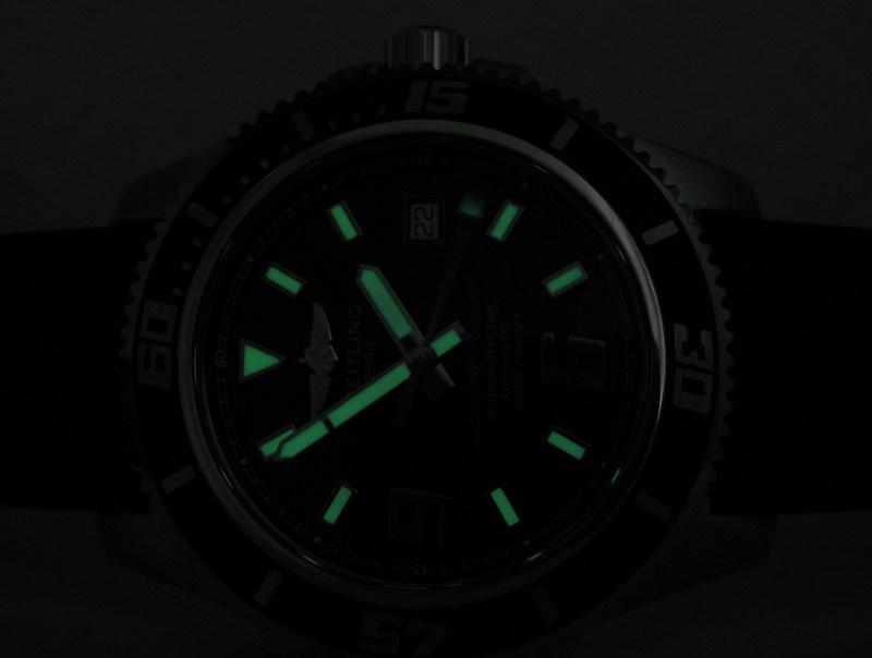
They both have incredible luminosity that is both bright and long lasting.

However, for the first time it is easy to justify coveting both models within a brands similar lineup because you can have subtle colour variations. Personally, I would choose the ocean blue details for the SuperOcean, for obvious reasons, and the white details for the SuperOcean Chronograph to add a bit of monochromatic class. It’s always nice to have the luxury of choice.

As always I would like to take this opportunity to thank Andrew Michaels Jewellers for lending me these two SuperOceans for this article.
All words and pictures by Richard Atkins (unless otherwise stated). Please ask if you wish to reproduce any of the material in this article.