Breitling decided seven years ago to take on the enormous challenge of becoming a manufacture (the ability to produce at least one movement that is developed and built in-house). This is a rarity amongst watch brands today because it takes incredible skill, determination and financial backing to achieve. Breitling did not aim for this much heralded achievement in horology simply to puff out its chest and say “Look at what we can do”, as other brands have done to simply help them gain respect. Breitling made this brave decision because they were aware that the ebauches (blank movements) they were using were becoming more and more difficult to buy in. Therefore, Breitling did not take the relatively easier route and create a simple three handed timepiece. They decided to create what is commonly known to be one of the most difficult movements to design and build to an exacting standard: the chronograph. Breitling did not stop there though and, in their desire to create something that would serve them well as a basis for creating desirable timepieces with useful features and within a high volume manufacturing environment, they created the Calibre 01 movement.
Please see my article on the history and development cycle of this fantastic movement here:
Breitling Calibre 01 – A History | Andrew Michaels Jewellers
This technical tour de force was built from day one in a state of the art high volume facility and has many useful complications and features. In fact, in opposition to most new movement announcements, the Calibre 01 was ready for full production when the press release of this movement was made at BaselWorld in 2009. The useful and clever attributes of this brilliantly conceived movement include COSC certification (a requirement for every single one of Breitling’s timepieces), 28,800 vph, 47 jewels, 70 hour power reserve, column wheel chronograph and an instant date change that can be adjusted at any time without any risk to the movement (normally the date should not be changed on a mechanical movement between the hours of 8pm and 3am).
The Calibre 01 movement was first introduced in 2009 in a case that was modelled on the Chronomat Evolution, which was a long time flagship timepiece for the brand. This was called the B01:
The next, obvious, step was to include a complication that is not only useful to any traveller but is also a reflection of Breitling’s Aeronautical heritage: The GMT function. This complication was introduced on the Calibre 04 movement in early 2011. As with the Calibre 01, the first watch this new movement will be presented in is a derivative of the Chronomat Evolution, the new B04 GMT:

So, what are the features that differentiate the new B04 GMT to its slightly older sibling, the B01?
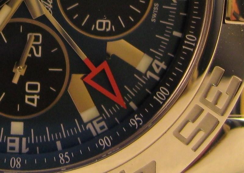
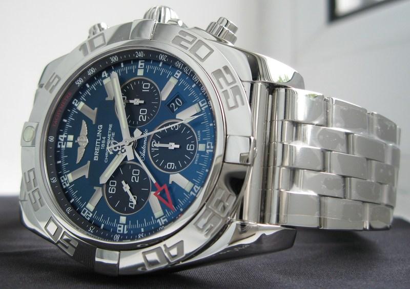
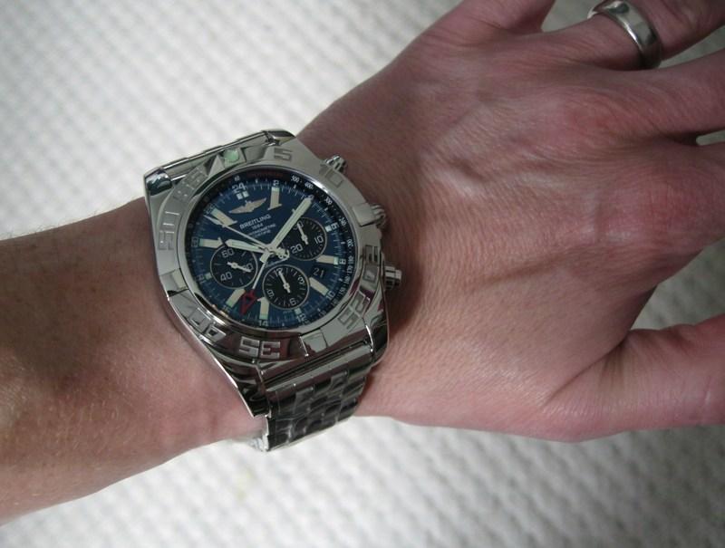
The main raison d’etre of this new movement and timepiece, is the aforementioned GMT complication. This is displayed using a large red tipped hand that circumnavigates the dial once every 24 hours. The red arrow jumps right out of the blue dial and makes reading the “home time” very easy indeed. This may have something to do with the fact that red and blue are at opposite ends of the visible spectrum. Don’t quote me on this though because I am a watch nerd not a physicist.
The case diameter has been increased from 44mm, for the B01, to 47mm. Some people may applaud this due to the current vogue and desire for men to wear large watches. However, I think that Breitling have done this purely to aid legibility of the dial which carries a lot of information. At the time of writing I have no information on the size of the Calibre 04 movement, so this could have a significant bearing on it also.
Breitling have, once again, applied their pro-active and attention to detail attitude towards this new complication and they have created a very unique and user friendly way of setting the hour to a different timezone. When the screw down crown is unwound it naturally rests at a position where the mainspring can be wound. Upon pulling the crown out to the first position the hour hand can be moved backwards or forwards in hourly increments without affecting the running of the watch. The date can be moved forwards or backwards using this function. This allows the user to keep the GMT hand to their own home time and set the hour hand to the time of their destination, be it in advance or behind the original time. This is a very natural way to control a GMT complication.
These elements above distinguish the watch as a new entity within the catalogue. Now let’s look at the elements that define the B04 as a high end desirable wrist watch.
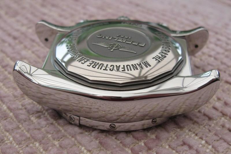
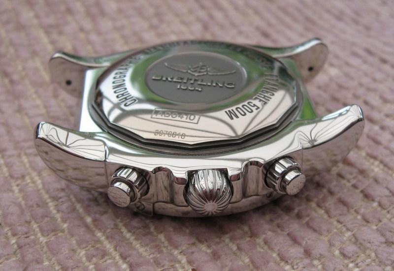
The case is beautifully polished throughout to a deep lustre. Despite being a pig to photograph I do like the myriad of reflections that this gives at anyone moment and it gives the case an almost chameleon like talent of randomly changing its appearance. Every surface has been given a high level of finish which results in a very high end feel. This is most prominent when turning the case over to view the perfectly rounded edges that have been created to aid comfort. In my opinion the one main area of finish on a high end timepiece that distinguishes it is the fact that there are never any sharp edges to the case. This becomes more important on a watch case that is 47mm in diameter.
The bezel is the very same design that was first seen on the B01. The outlandish 70’s font used for the numerals has provoked many a divided opinion. I absolutely love it. I think it is bold and a little bit cheesy. With a watch that costs this much and has multiple functions to perform the whole aesthetics could become a little too serious. This watch has been designed to be worn every single minute of every day. In my humble opinion it should therefore make the wearer want to wear it forever. Some designs can become a little stale if viewed over and over again. I think there is enough of a difference between this very cool font and the rest of the watch to draw the eye of the user, in a good way. I’m no Freud but I think that’s why I like it so much.
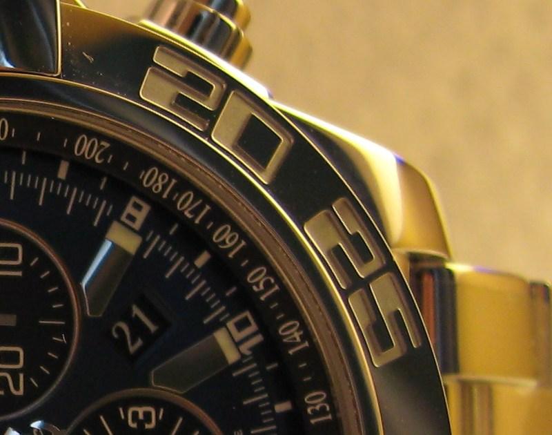
Another design detail of the bezel reflects the incredible attention to detail that has been indulged upon the B04: Look closely at the rider tabs on the bezel and you will notice that the section in between discretely slopes from the left to the right.
I am guessing that this is to allow better grip upon the uni-directional bezel when rotating it anti-clockwise. A very neat solution indeed.
The dial has a lot going on. Not only is there the opposing sunburst and brushed patterns within the dial but the information presented includes hours, minutes, seconds subdial, chronograph hours subdial, chronograph minutes subdial, chronograph seconds, date, tachymetre and, of course, the dual time GMT display. And yet Breitling have achieved excellent legibility and readability through the use of bold and individually designed and appointed functional elements.

The hands are all highly polished and have a simple design that fits in nicely with this utilitarian timepiece. The hour hands do at first seem to be a little small in width but I think this is an optical illusion born out of the fact that they are slimmer than the hour markers. Whatever the reason their legibility is not impeded by this seemingly lack of girth.
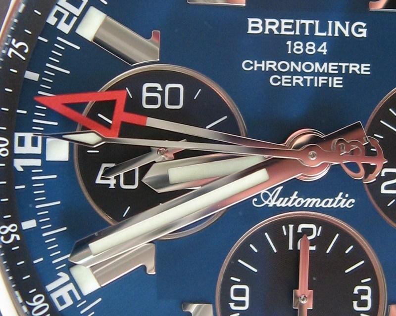
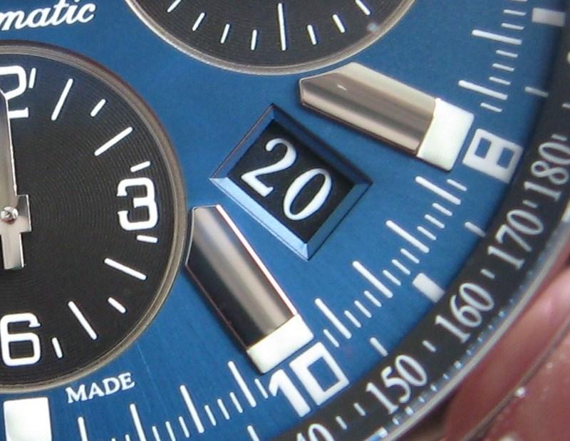
The markers mentioned above are a new design for the B04 in that they follow the edge of the dials inner square. In all honesty the jury is still out on this particular aesthetic touch. It seems a little over zealous to me and doesn’t follow the clean classy lines of the rest of the dial and case. Also, with the date display between the 3 and 4 O’clock positions this gives a non-symmetrical look, which doesn’t work on a design element that is so bold.

I also think that the new hour marker design detracts from the stunning interplay of brushed inner square and sunburst patterned outer section of the dial. This wonderful dichotomy looks simply gorgeous on the blue dial highlighted here.


The date is displayed through a dial aperture between the 3 O’clock and 4 O’clock markers. The date is possibly the weakest feature on the dial, by its size, but the use of white on black gives good legibility at a glance.
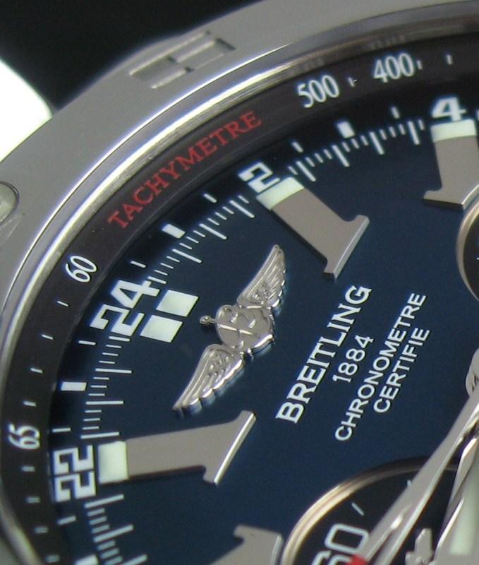
Around the raised chapter ring of the dial there is a tachymetre display which adds further functionality by allowing the user to calculate rates per hour, speed, etc. The chapter ring has been given a nice design element in the fact that it protrudes as a triangle from the edge of the case. This gives a subtle illusion of it floating. I liked the squared chapter ring of the B01 but this is equally as charming.
The subdials are differentiated from the rest of the dial in that they are black, recessed and have a polished circumference. Yet another font is used for the numbers on these dials that highlight the seconds, chronograph hours and chronogragh minutes.

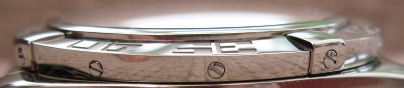
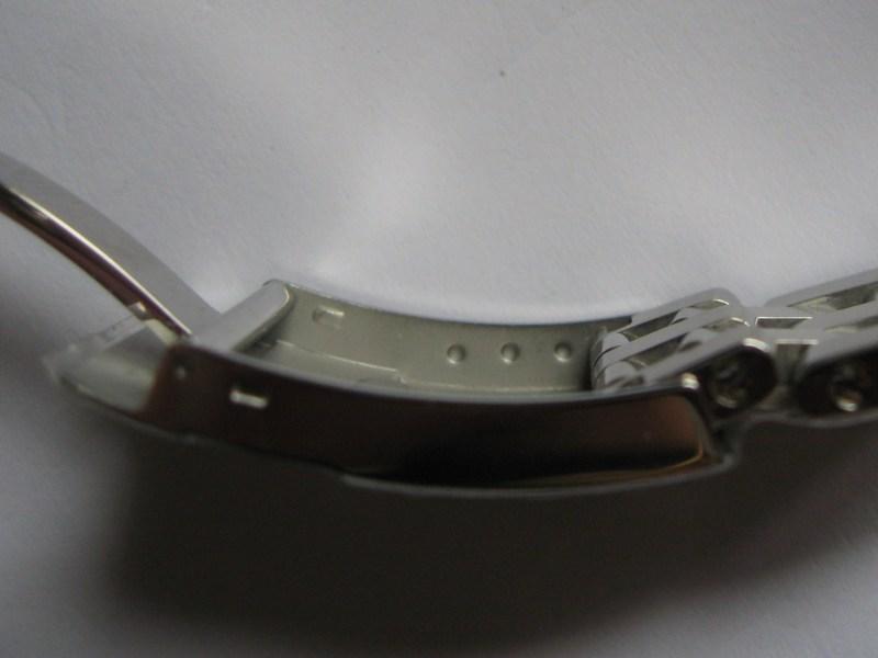
As proof that every single element of the B04 was viewed as something that could be improved on even the clasp is new. This now has a very clean external look which is facilitated by the fact that the adjustment spring bar does not slot into through holes within the clasp but is now seated in recesses. The end of the bracelet therefore had to be redesigned as well and is very similar to the opposite end which connects to the case. This may be a little more fiddly to adjust but I believe this extra labour is worth it to achieve the more visually appealing clasp and, of course, once the bracelet is fitted to the owner there should be no further need for adjustment.
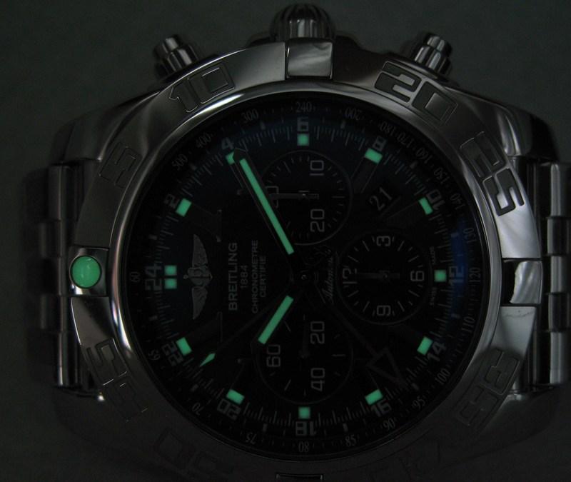
As is befitting a tool watch that can be used 500m under water (which is remarkable in itself as a lot of aspiring divers watches on the market cannot claim that) the luminosity must be very good. The B04 does not disappoint, being both strong in illumination and long lasting.

The B04 is not only beautiful to look at but it is also very tactile. The bezel is a pleasure to use. It is, at once, smooth and easy to turn and yet gives a reassuring and definite click into each position.
The buttons are easy to press but not so much that they could be accidentally operated. This is further aided by the screw in collar that prevents the buttons from being pressed under water. The crown is carried over from the Chronomat Evolution and has a fluted dome profile which allows good purchase without any discomfort. It is, actually, one of my favourite crowns to both look at and use.

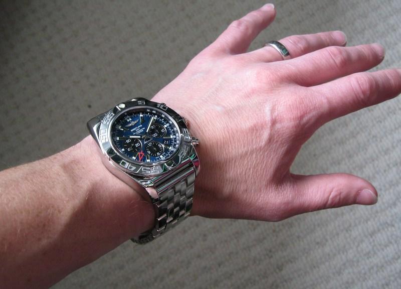
In conclusion I will refer to my first reaction upon seeing the press release for the B04 last year which was “How much?” I am so pleased to have been given the opportunity to spend time with the B04 and realise that this new flagship timepiece for Breitling really is worth the asking price. There will, understandably, be misconceptions with respect to whether a Breitling watch should be competing in the same price bracket as other high end brands. In this respect I think Breitling have been a victim of their own success in creating this attitude amongst watch fans. For many years they have offered some of the best value entry level watches on the market. It was then relatively easy to upgrade, as a reflection of the owner’s own situation, to one of their flagship models: A Chronomatic Evolution, one of the Navitimers or a Super Avenger, for example. It is to Breitling’s credit that they want to create a further step up from this with their new range of perfectly finished and designed timepieces that are powered by their own in-house movement. So, although the B04 seems irrationally priced for a Breitling I personally think that this pro-active brand is once again thinking of the future and can see a successful future in their high end wrist watches with their own complicated in-house movements. I also think that once the initial knee jerk reaction to the price has been overcome and people realise that it is totally justifiable in that Breitling have continued their value-for-money philosophy the B04 will be a great hit. Rest assured that the B04 compares favourably to anything else like it on the market and it is worth every penny. It is a timepiece that will afford the owner every function they could ask for whilst also giving them something superbly finished and detailed that they will cherish for as long as is required. Despite it’s extended dimensions it is very comfortable to wear and the extra weight simply adds to the feeling of robustness and security in its ability to maintain its high level of timekeeping and functionality when confronted with any real world demanding situation. Apart from a few subjective issues I have with the watch which are highlighted within this article the only criticism of the B04 GMTI have is due to personal frustration in that the B04 is too big. Well, it’s too big for my 6.5” wrists anyway. After spending some considerable time with this exceptional timepiece and being afforded the luxury of discovering its many wonderful and useful details I am left with a hollow feeling that I may never own what I consider to be Breitling’s new flagship model.
My deepest gratitude goes to Andrew Michael Jewellers for lending me this B04 to review.
All words and pictures by Richard Atkins (unless otherwise stated). Please ask if you wish to reproduce any of the material in this article.