
Most watch brands that have aspirations of indulging a male demographic have at least one pilot’s watch in their catalogue. These are often contemporary replicas of the first ever timepieces worn by pilots in the 1920s, which were basically pocket watches with lugs attached or the pilot’s timepieces of WW2, which were designed specifically for the job.
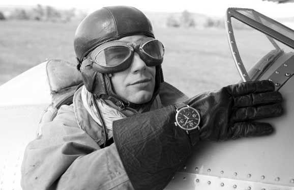
Image courtesy of bellross.com
In the very recent past many brands have reissued watches from their own past that were originally designed for the military. Bell and Ross did not have this luxury as they were conceived by Bruno Belamich and Carlos A. Rosillo in 1992.
So, Bell and Ross entered this market with their own interpretation which was, ingeniously, inspired by the dashboard instrumentation of World War 2 planes. These quickly became very popular.
Their latest incarnation is also cleverly conceived and is an homage to the original wrist watches that were, basically, pocket watches adapted to sit on the wrist. This originally came to be in the first World War when officers of the military, who were issued with pocket watches, found it incredibly inconvenient to be having to reach into their pockets for the time, every time. As mentioned above makeshift leather strap was attached to the watch by soldering metal loops to the top and bottom of the watch.
You can see Bell and Ross’ philosophy for their military styled watches from this press release graphic below:

Image courtesy of bellross.com
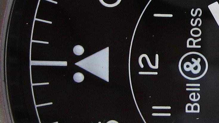
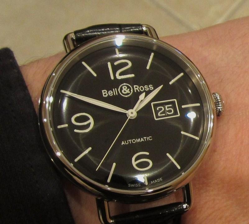
Bell and Ross have an immediately recognisable style. The WW1 and PW1 models that were announced earlier this year further emphasise this design ethos which simply works. WW1 is Bell and Ross’ acronym for Wrist Watch 1 which also, conveniently, stands for World War 1, of course. PW1 stands for Pocket Watch 1. Their main inspiration of aeronautical instrumentation is clearly evident. As I’ve mentioned in previous articles, it was a very wise decision to utilise the cockpit dials as the inspiration for their own pilot’s instruments. This allows Bell and Ross to achieve their own design aspirations, which include legibility at the forefront.
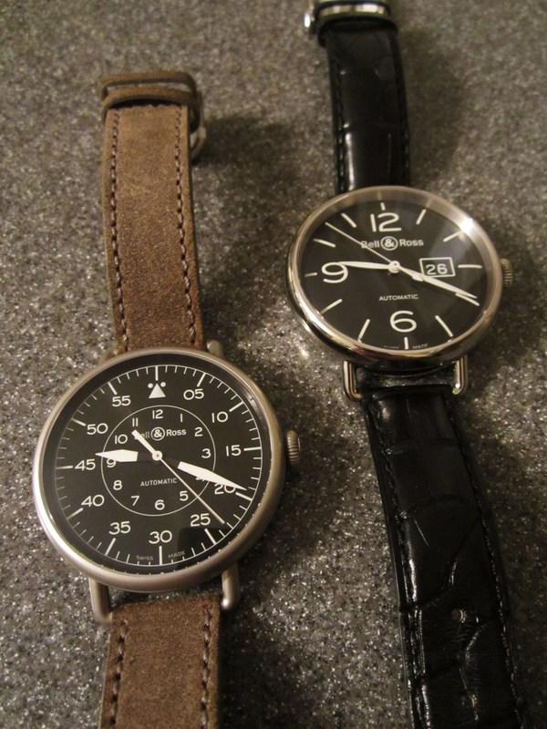
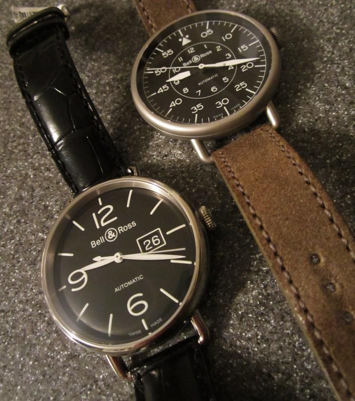
There are three versions of the WW1: The WW1-97 Reserve de Marche, the WW1-90 Grande Date and Reserve de Marche and the WW1-96 Grande Date featured in this review.

Reserve de Marche (image courtesy of bellross.com)

Grande Date and Reserve de Marche (image courtesy of bellross.com)

Plus, the wonderful mechanical hand wound 49mm PW1 (Pocket Watch 1) (image courtesy of bellross.com)

Further to the simple, and clearly legible, WW1 above is the WW1-92 Military.
There is also a Heritage version which incorporates the tan coloured elements that are a focal point of all of Bell and Ross’ Heritage timepieces.
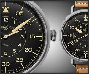
Image courtesy of bellross.com
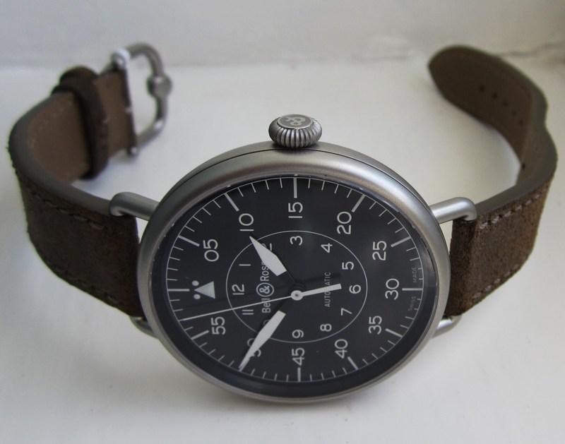
This timepiece uses the same case design and dimensions as the WW1 above. The hands are reminiscent of those specifically designed for legibility by watch manufacturers when they were tasked with creating watches for pilots. These hands are more legible than the thin dauphine hands utilised on the WW1. However, there is an offset in dial legibility as a result of Bell and Ross utilising another feature of vintage pilot’s watches, the so-called navigation dial. This creates a busier dial but it is slightly more interesting and unique. Whereas the WW1 is a homage to those very first military wrist watches, that were simply pocket watches with lugs soldered on, the WW1 Military and Heritage are clearly derivations of early pilot’s watches.
These two siblings share the same case design and overall design philosophy but are really a world apart. Well, a World War apart at least. So, let’s look at the individual elements that make up the whole of the great two historically pertinent timepieces.
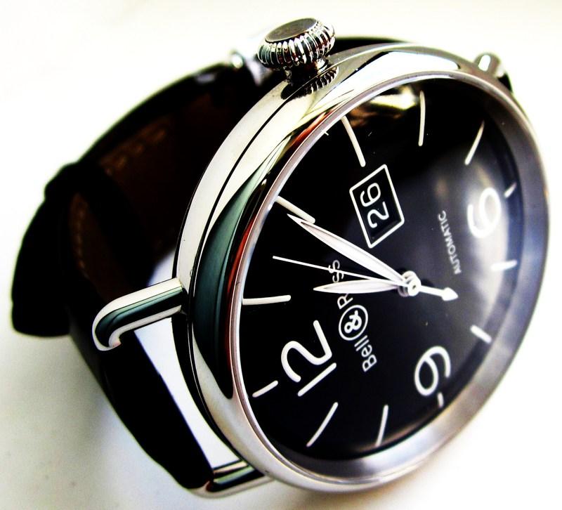
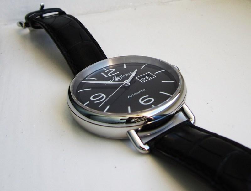
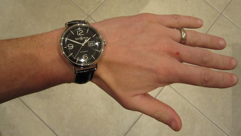
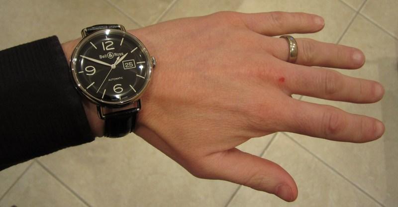
Both the WW1-97 and WW1-90, showcased here, have a unique look amongst contemporary wrist watches. The thin straps, thin lugs and even thinner bezel give the illusion of the WW1 being all-dial when it is on the wrist.


It recalls a time for me of when I was a young boy and wanted a watch like my father. I was unable to tell the time and, therefore, could not justify having a watch of my own so I used to draw a great big dial on my wrist. Surely it wasn’t just me? I’m stretching the memory banks to the limit here because I know I could tell the time when I was 5 years old. Yes, the madness started very early on for me.
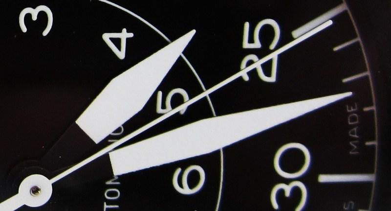
The very open dial allows Bell and Ross to include complications, such as the big date and power reserve displays without the dial becoming cluttered.

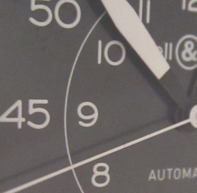
The exact same thing can be said of the large Arabic numerals that are used.
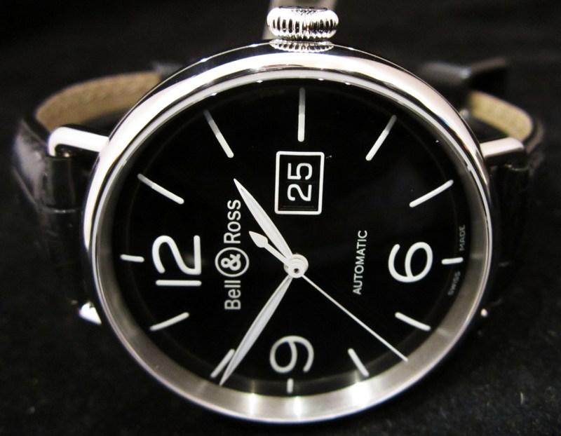
The case of the WW1-97 is highly polished stainless steel and suits the round case.
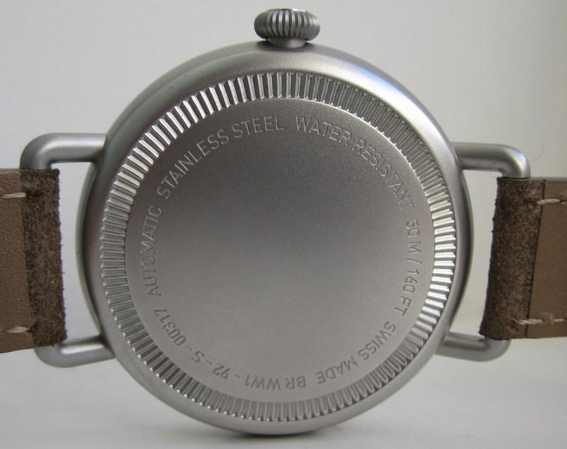
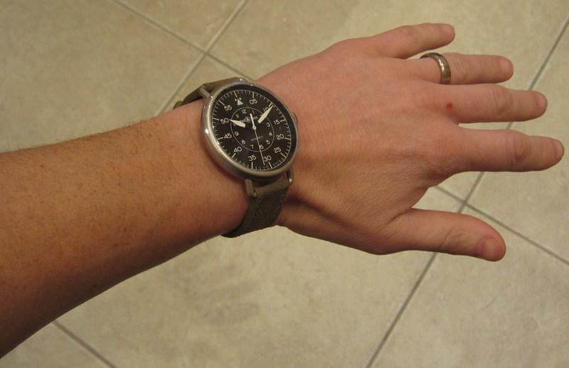
However the WW1-92 is sandblasted stainless steel. This looks almost like titanium. It is not as pretty as the WW1-97 but it does look fit for purpose. It is also a reflection of the unfinished cases of the watches given to pilots solely to allow them to perform their jobs.

The WW1-97 is definitely the most dressy of the two. In fact, when I am generously leant watches for reviews by Andrew Michaels Jewellers I always like to show them to as many family, friends and neighbours as possible to gauge their reactions. The polished WW1-97 has been unanimously liked and some have even proclaimed it as the nicest watch I have shown them. I think this is down to the classical, clinical and well-proportioned aesthetics.


There is a slight price differential of the two. However, this is purely down to the complications offered on the polished watches. Dimension and material-wise they are identical. Apart from the additional complications of the polished versions the only other disparities are the case finish, the dials, the hands and the straps.
The dial of the WW1-97 has a subtle sunburst effect. It is also slightly domed towards the edge. This is reminiscent of the original pushed-in paper (yes paper) dials that were used on the ‘throw-away’ watches that were given to military officers. These two details allow for a wonderful refracted light visual.
The WW1-92 dial is matt black and again a representation of the original World War 2 pilot’s watches.
There are also other visual cues to their vintage military watch inspirations.
The hands of both watches are sympathetic to their heritage. The bold hands on the Military offer better legibility during day and night but this is counteracted by the busier dial. The thinner, dauphine styled hands of the Big Date are in-keeping with the classic and elegant looks and the clean legible dial.


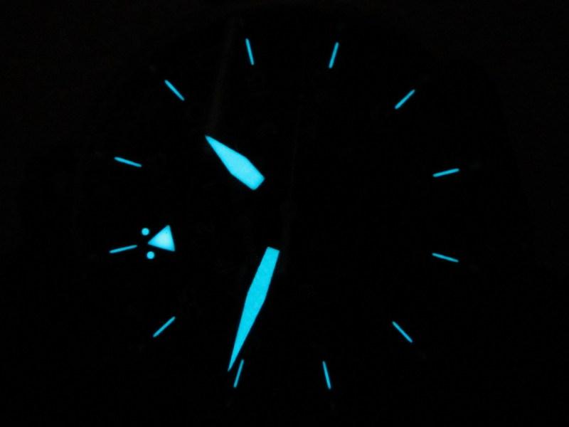
The lumes on both watches are visually appealing. I have witnessed stronger illumination but they both last through the night.

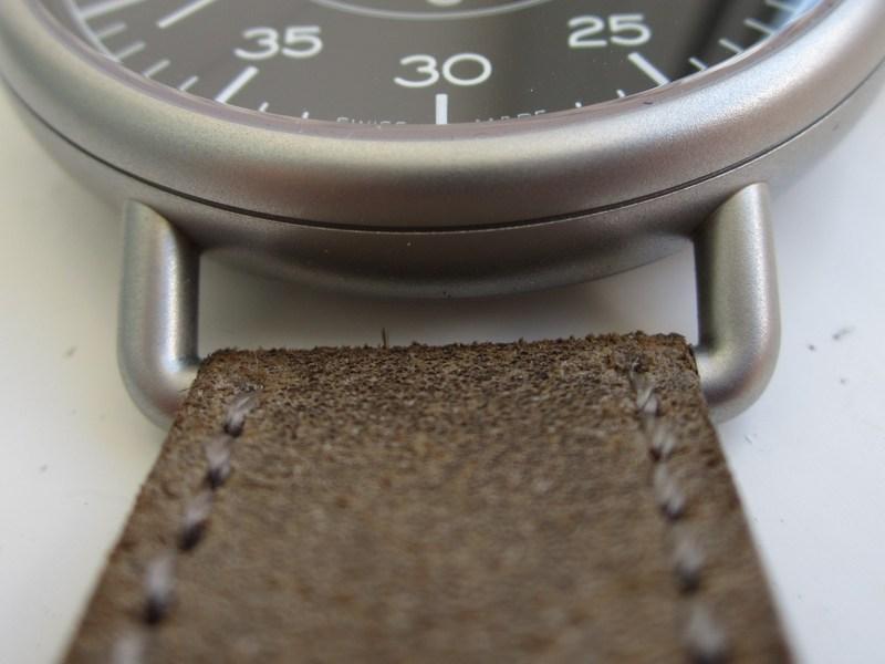
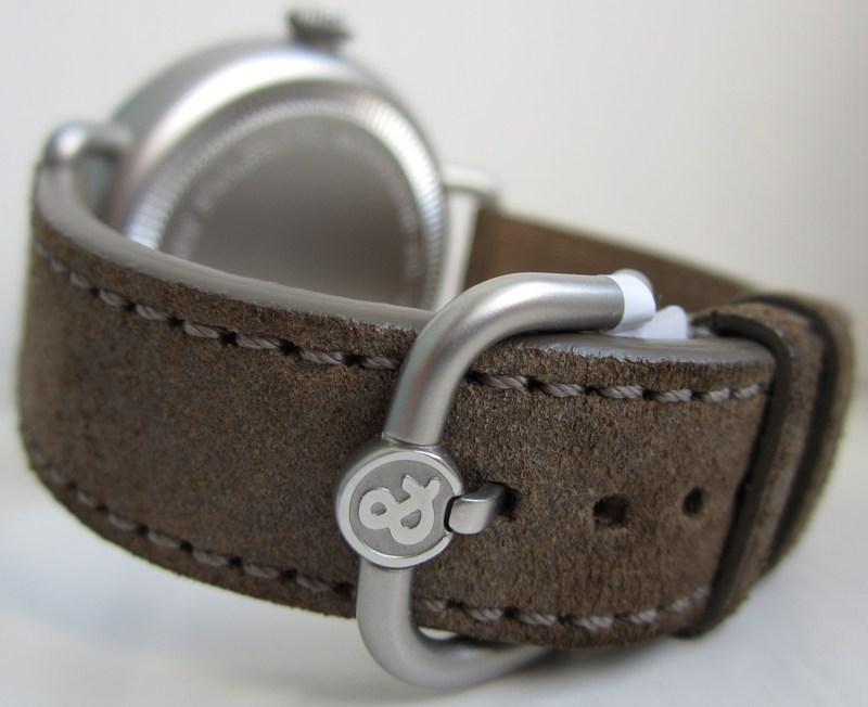
As mentioned above one of the main elements that make this collection of watches stand out and meet their objectives of respecting the original vintage timepieces is the choice of thin, looped lugs and equally thin yet elegant straps. These create a true focal point of their own, despite allowing the dials to become the main focus, as is desired for a legible utilitarian watch. The buckles are also a work of art. They reflect the aesthetics of the lugs and incorporate a wonderfully detailed Bell and Ross logo. Normally straps with buckles are cumbersome to a watch collector because they demand patience when removing and, especially, when putting on. However, the buckles here are a pleasure to use and the exercise becomes one of tactile cosseting. No, really.
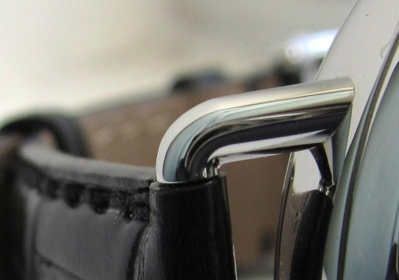

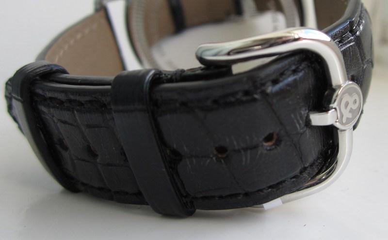
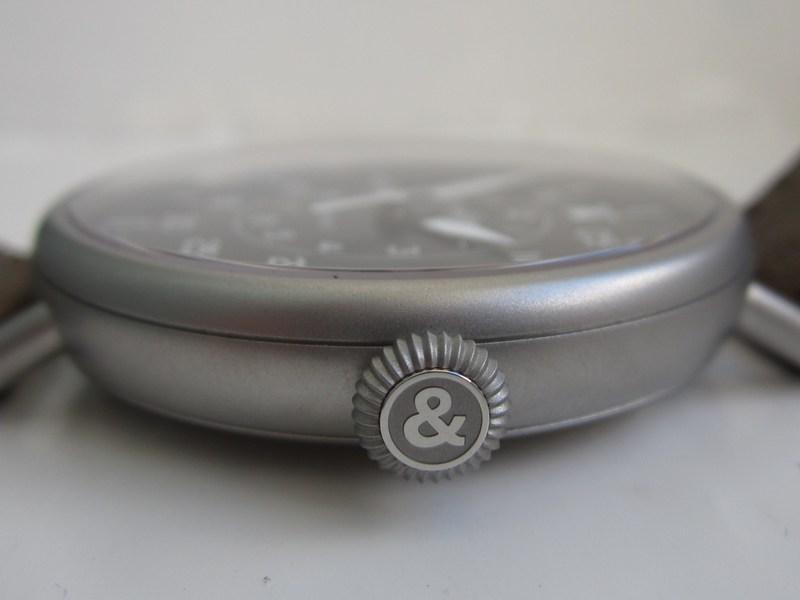
The case backs are simple and reminiscent of the period watches. Information about the watch is discretely etched into the periphery of the caseback. I particularly like the mirror-like highly polished caseback of the WW1-97, which is a reflection (if you’ll pardon the pun) of the quality of fit and finish of both of these timepieces.

The polished cased WW1s look equally at home accompanying a t-shirt or a dress shirt.
I’m not so sure about the Military with a dress shirt though. It has more of a casual facade.
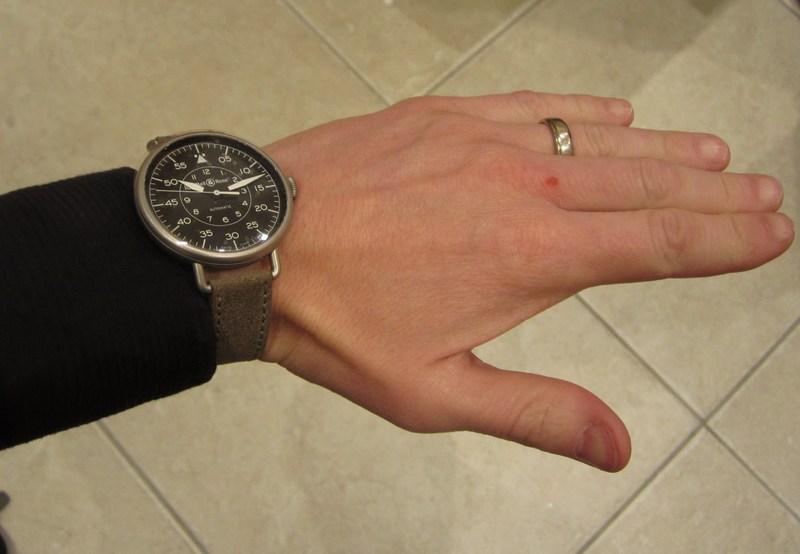
The crowns are downsized representative of the originals. The crowns on the 1920s wrist watches were large because they were from pocket watches. The crowns on the 1940s pilots watches were large because they were designed to be used with thick gloves on. Wisely Bell and Ross have decided to use the original design but keep the size more in-line with the rest of the watch and it’s classic aesthetics. I wonder how many of my friends and family would have liked it so much with the larger crown.


Since the early part of the new Millennium Bell and Ross have created distinctive and desirable timepieces that not only perfectly represent the genre and audience they are aimed at but also have allowed Bell and Ross to stand out from the crowd. This new collection is no different and does not disappoint at all. However, they are not perfect: I would have loved to have seen the crown at the top of the WW1, or at the very least on alternative version that had this unique feature. This would have garnered further appreciation from the horological historians and would have been an inspired homage. I don’t think I would have printed “Automatic” on the dial either. I realise that this reflects the contemporary nature of this collection and the convenience that Bell and Ross has built into this WW1 watches. However, it is not a reflection of either of the watches they, otherwise, successfully celebrate. Maybe having the WW1-92, etc, identification would have been visually exacting. Further still, I would have liked to have seen a leather strap/holster that would accommodate the PW1 and allowed it to be worn on the wrist.
The previous paragraph sounds like I do not like the new WW1 collection from Bell and Ross but nothing could be further from the truth. I have highlighted what I think are possible elements that could further aid the concept of these timepieces being true homages to those timepieces that served the military in the harshest of conditions and should, as a result be reverred. It may be that Bell and Ross did not want this. However, I do think it is a reflection of their success in creating these homage watches that I care enough to be bothered about the minutiae.
I do hope the PW1 is successful for Bell and Ross but they are up against serious competition in this market at this price point from some stunning and original complicated pocket watches from the 1800s and 1900s. Pocket watches will always be covetable, if not entirely practical. I have a collection of vintage pieces myself. It’s a brave move by Bell and Ross to bring the PW1 to the market but when have you ever known Bell and Ross to take the risk-free (some may say boring) path with their designs.
All words and pictures by Rick Atkins and Bell and Ross. This article may not be reproduced in part or in whole without the permission of the author.