The Monaco is the most significant model in Tag Heuer’s history, and not because the coolest actor ever, Steve McQueen, wore one in a movie.
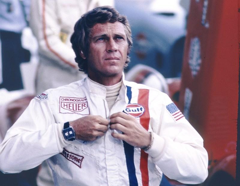
Image courtesy of tagheuer.com
I appreciate that Jack Heuers original marketing genius does allow Tag Heuer to continually use this as a means of publicity but I can think of many other significant reasons why the Monaco should feature within any collection of timepieces. I am aware that Steve McQueen personally chose the Monaco for his role in the 1969 “Le Mans” film. Despite his good looks and personal charms being enough to warrant him the leading role in any blockbuster Steve McQueen did take his acting very seriously and his attention to detail was well known. He should have probably worn Heuer’s Autavia for the film because that is what Jo Siffert wore.
Jo was a Grand Prix Champion, a winner of the 24 hours of Daytona and the 12 Hours of Sebring. The two were also very good friends. Steve’s eye for authenticity meant that he wanted to appear exactly the same as Jo. This resulted in Steve wearing Jo’s own racing suit, which happened to have the Heuer Chronograph logo on as he had become the first watch brand sponsored ambassador in motor racing. This was a result of Jack Heuer’s, aforementioned, marketing genius and it couldn’t have worked out better for the brand and the extra-ordinary new Monaco timepiece. As I mentioned earlier Jo wore his Autavia but Steve preferred the Monaco, and the rest is history.
Despite this wonderful slice of history, for which many brands would give anything for, the Monaco should be heralded for so much more.
For a start it was the first ever water resistant square watch, and the first of a group of automatic chronograph timepieces.

The former was a great engineering achievement whilst the latter is the most important to a horolophile (I may have just made that up) like me because the original Calibre 11 was a result of the joint venture of Heuer, Breitling, Hamilton, Buren and Dubois-Depraz in their attempt to create the very first automatic chronograph movement. The man who was responsible for the technical development of this revolutionary (literally) new movement was Gerald Dubios. He was the technical head of Depraz & Cie, which was renamed Dubios Depraz SA in 1968, and were one of the main suppliers of chronograph movements at the time. Dubios Depraz needed considerable backing to bring their new movement to market. The technical and marketing benefits were recognised by Jack Heuer, CEO of Heuer-Leonidas, Willy Breitling, of Brietling SA, and Buren, a movement maker purchased by Hamilton in 1966. The resulting 19,800vph calibre 11 was the first ever automatic movement announced to the world on 3rd March 1969.
Secondly the design is ageless, iconic and instantly recognisable. It is one of those few watches for which there are models available today which very closely resemble the original from over 40 years ago and yet it has been used as a basis for some very modern looking interpretations for the vehicle of Tag Heuer’s recent technological inventions.
These include the automotive inspired belt driven V4, the incredible shock resistant 24, the linear display LS and even the digital/analogue 69. Sadly, I have not had the fortune to have seen the V4 in person but I have handled the 24, 69 and the LS and they are all stupendous.
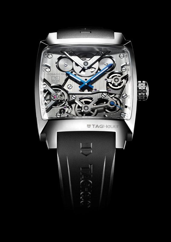
Image courtesy of tagheuer.com
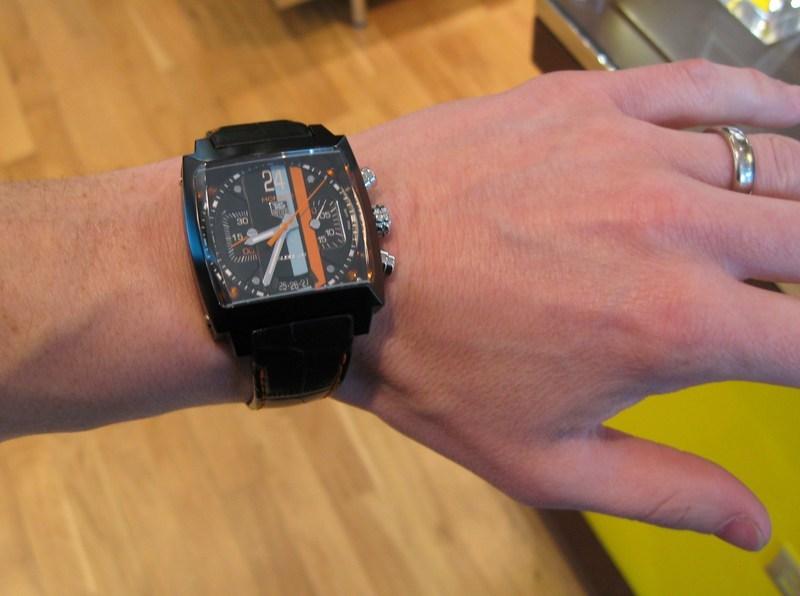
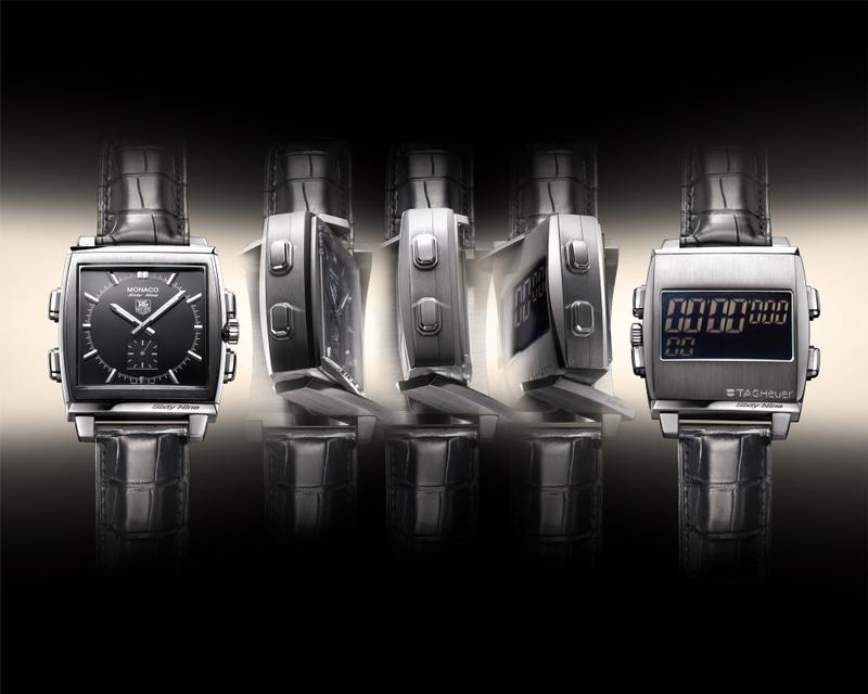
Image courtesy of tagheuer.com

I honestly believe that there are a handful of wrist watches that should appear in any serious watch collection: Breitling’s Navitimer, Rolex’s Submariner, Jaeger LeCoultre’s Reverso, Omega’s Speedmaster “Moon Watch” and Tag Heuer’s Monaco. The older the better for all of these but the modern interpretations are all magnificent as well.
This statement reflects my admiration and sheer lust for each of these timepiece’s history and ageless designs.
The Monaco is therefore one of my favourite watches and the one I have been leant for this review is my favourite modern Monaco. I’ll try to curb my enthusiasm and remain impartial to make this review as balanced as possible, but I can’t promise anything.

It may not be immediately obvious why this particular example should garner so much respect. However, allow me to wax lyrical for a little while.
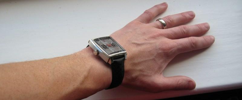
Upon initial inspection you may be forgiven for thinking that this Limited Edition Monaco Vintage is a standard current model Monaco with a grey dial. It may take someone with a reasonable knowledge to realise the subtle differences and then to fully appreciate their relevance.
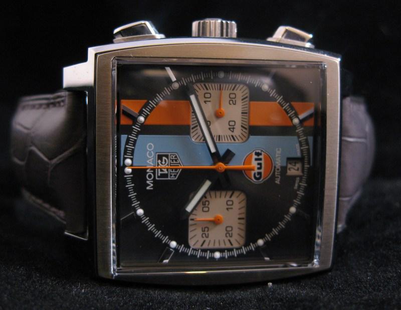
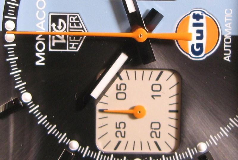
Below are a couple of examples from the current range of Monacos. The first is a standard black dial Calibre 12. The second is a Limited Edition Gulf. There are many other variants that should be checked out:


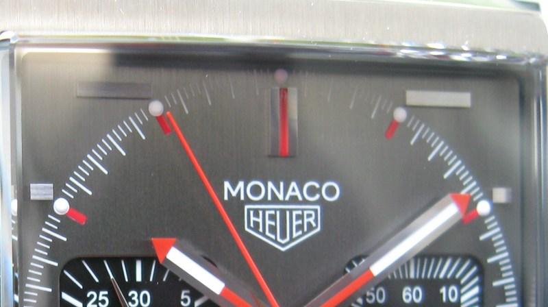
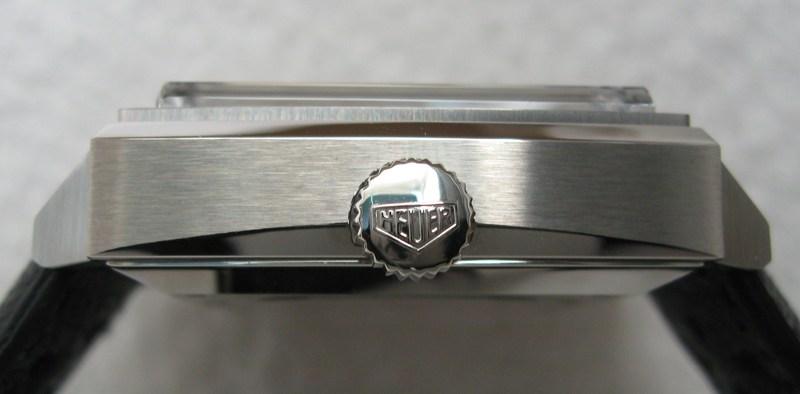
The first noticeable divergence is the crown being positioned on the left of the case. This is as a result of Tag Heuer’s new Calibre 11, as opposed to Heuer’s original Calibre 11. Allow me to explain: TAG (Technique d’Avant Garde) bought out Heuer in 1985 and the brand was renamed TAG Heuer. The original Calibre 11 was the first ever automatic chronograph movement, as discussed above. This differs from the current Calibre 11 (named only through historical homogeny) in a few ways but most notably the frequency has now been increased to the industry standard 28,800vph from the original 19,800vph. The original 1969 Monaco’s crown was also on the left which is what makes this Limited Edition model historically pertinent. The current standard Monaco uses the Calibre 12 which has the crown on the right, which is fairly standard these days. Confusingly, there was also an original Calibre 12 from the early 1970s. This was the upgrade to the Calibre 11 in that the frequency was increased from 19,800vph, as already mentioned, to 28,800vph. The original Calibre 12 also had its crown on the left. Still with me?
So, we have our first significant change in design over the current Monaco that allows this Limited Edition Vintage to resemble the fantastic original. The second homage to the original is the dial.

When most watch fans think of the Monaco they automatically think of the blue dialled version, such was the impact of Steve McQueen wearing his time as Michael Delaney. However, almost straight away there was a grey dialled version as well.
This Limited Edition is homage to that alternative. I do think the blue that Heuer chose looks gorgeous on the Monaco and yet I would still have the grey dialled version simply because “everyone”, relatively speaking, has the blue dialled version. Also the brushed blue dial simply looks light blue or dark blue, depending on the lighting conditions. The grey, on the other hand, has so many different personalities and tricks given differing illumination.
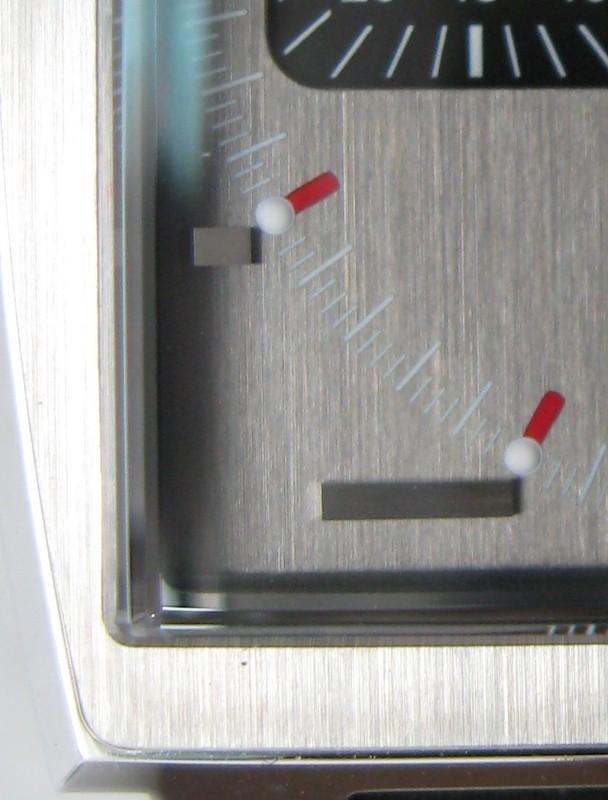
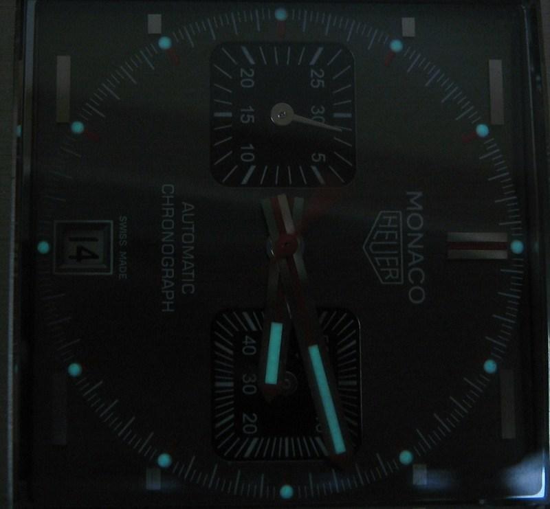
Viewed straight on we are greeted by a light grey dial with all other elements perfectly legible. Turn the face slightly and the dial immediately turns from dark gun metal grey all the way through to an absolutely stunning brushed aluminium surface, including battle ship grey and charcoal on its way. Remarkably, each one of these separate hues works perfectly with the red details of the hands and hour markers. It really does constantly delight. It is one of those rare watches that can produce many different facets.
However, this dial’s party trick is only revealed when it is fully illuminated with bright light, for instance sunlight. The white text and markers on the dial completely disappear. Now that’s magic.

This gives the whole face a surreal look in the fact that all that can be seen is the hands, the subdials, the applied hour markers and the red hour markers. This is an optical illusion on a par with the beautiful lady that can look like an old hag, depending on how you look at the picture. This simile is quite relevant because upon viewing the Monaco Vintage for the first time you could be forgivan for thinking its not the best looking watch on the market (although certainly no hag), yet when you take time to truly look at it the beauty shines through.
Another discrete difference to the current standard Monaco, and which is a perfect reflection is the applied hour markers. These are all horizontal. I love the look of these and much prefer them to the standard hour markers. Their applied and brushed appearance gives them a contemporary look whilst retaining the vintage look of the original.
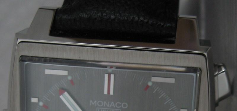
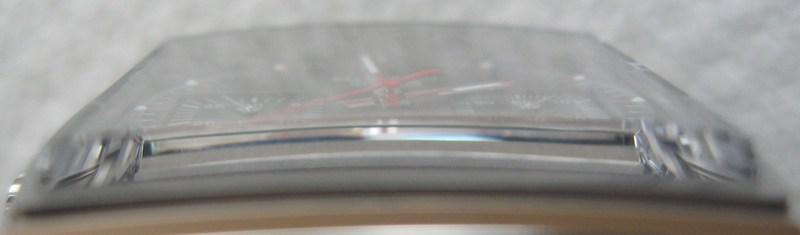
If the case was not functional it would be an objet d’art. The abrupt lines of a square have been subtly softened by rounding each edge. The contrast between high levels of polishing and meticulously applied satin brushed finish is beautifully realised throughout.


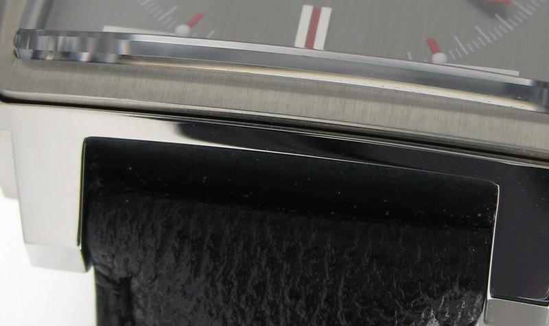
The sapphire glass is slightly curved, which gives a feeling of high end watch manufacturing and is a reflection of the commitment of Tag Heuer to produce beautifully crafted timepieces.

This aesthetic fits in perfectly with the slightly curved case. The glass has no anti-reflection treatment. Although this is no divers watch this does seem a little remiss as reflections can sometime impede the dial. Not so much for the time telling capabilities, due to the bold hands, but these reflections can obstruct the enjoyment of viewing the stunning grey/silver dial. Yet another playful characteristic of this highly enjoyable watch is the refractions given by the raised and chamfered edges of the sapphire glass. This kaleidoscope like visual attribute is not something normally seen because of this.
The hands are almost perfect replicas of the original grey dialled Monaco and yet they look as if they could have been designed very recently. Just like many of the other design elements of this fabulous retrospective watch they seamlessly blend vintage and modern aesthetics. This is a true reflection of how ageless the original Monaco was.

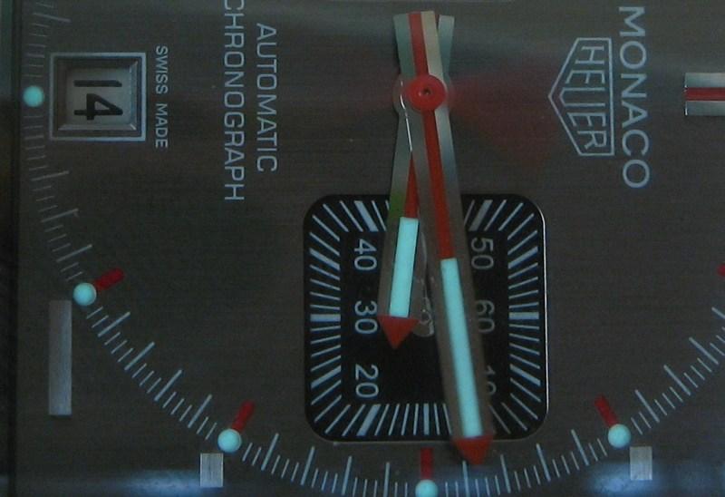
The luminous material applied to the hands and the hour markers allows for the time to be read in any lighting conditions. It may not be the brightest of lumes, usually the domain of the divers watch in all fairness, but the illumination does last through the night and allows easy reading of the time during the witching hours.

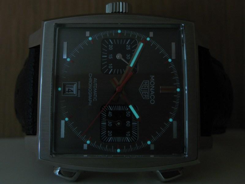
One slight disappointment with this Limited Edition Monaco Vintage is the date window. The original was framed by a raised metallic surround. The updated version simply has a printed frame. It’s just not as cool.

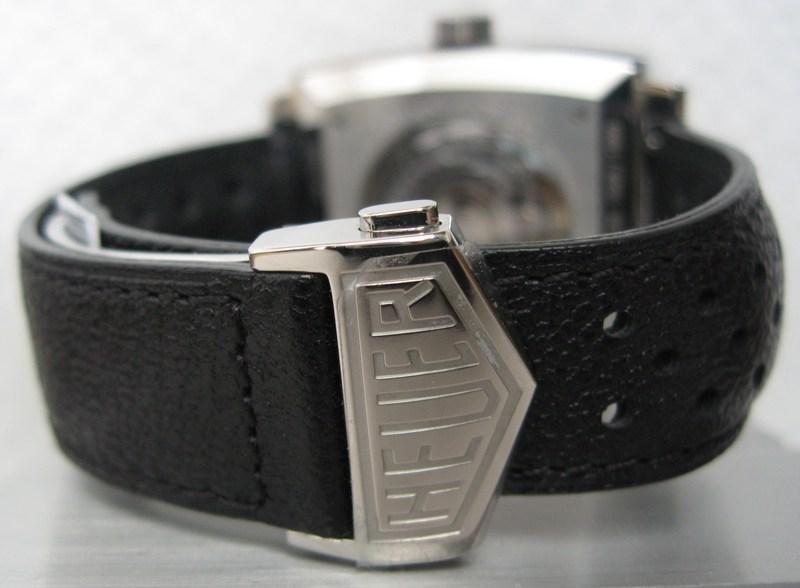
The strap and buckle are at once retrospectively designed and modern in appearance and utility. The strap changing facility is a total revelation and you wonder why other manufacturers have not come up with something similar. You simply slide the retainer to one side and this releases the strap. It is the most simple and elegant way of changing a strap I have seen. The only downside of this brilliant design feature is its irrelevance: The strap is so befitting of the original and beautifully made you would’t want to change it anyway.

One other reason that I prefer this grey Vintage model to the blue dialled one released in 2009 is the subdials have polished hands. This is opposed to the black painted hands of the blue version which, although looking historically correct do not look as suitable for a high end watch such as this in my opinion. One disappointment is that, due to the bicompax dial layout there is only a 30 minute chronograph totaliser. However, I do like the fact that this totaliser registers elapsed time as a true representation, and not the normal way of incrementing the time in one minute segments.


The crown has the original Heuer logo which, along with the dial and clasp logos, is a nice touch. It is not a screw down affair but this Monaco Vintage is still water resistant to 100m, which is enough for any non-professional diving situation.
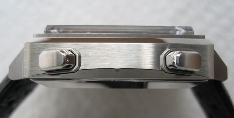
The pushers have been considerably updated from the originals. They ooze elegance and strength. Their ergonomic design means that they are comfortable to use. The chronograph function can be started, stopped and reset with minimal pressure.
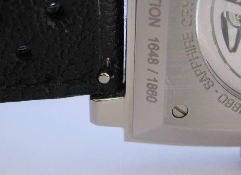
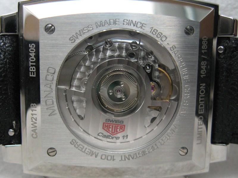
As mentioned previously, this Monaco Vintage is a Limited Edition timepiece. Only 1860 will ever be made. This reflects the fact that Heuer started in 1860. The Limited Edition number is LASER etched on the caseback. Upon flipping the watch over we are also greeted with the wonderful sight of the present day Calibre 11 movement through the exhibition caseback in sapphire glass.
The Monaco Vintage is slightly smaller than the current model: 38mm square to 39mm square. I do not know the reason for this but, as you can imagine, it makes very little difference to both the looks and feel. Comfort is a big draw because you are hardly aware you are wearing this largish wrist watch.
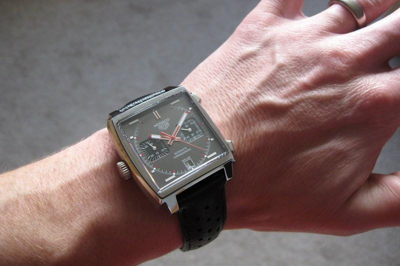

38mm is, of course, considered a small size for a gents timepiece in today’s society. However, this is a square watch and my elementary maths allows me to determine that the Monaco Vintage has the same dial real estate as a 43mm diameter round watch.
In conclusion: I’ve been incredibly impressed with Tag Heuer in recent years and my opinion of them and their products have gone up ten-fold as a result. I now actively go looking for their announcements at BaselWorld each year. I have not been left disappointed with their innovatative and exciting new watches, including the aforementioned V4, Mikrograph and Mikrotimer plus their Pendulum movement and their shock absorbed 24 Monaco, to name a few. It is almost as if they have reinvented themselves. I was one of those watch fans that lamented the old glory days of Heuer after TAG had taken over and seemed to want to dilute the TAG Heuer catalogue with meaningless and characterless quartz watches. Their efforts to enter the upper echelons of the horological food chain have resulted in some technological marvels that would be the pride of any manufacture. This change in attitude has also filtered down to Average Joe who cannot justify tens of thousands on the V4, Mikrotimer, Mikrograph, etc. The build and finish quality across the whole range of increasingly interesting models has also gone up. Attention to detail is also at an all time high, as can be seen with some of the details of the Monaco Limited Edition highlighted in this review.
Most collectors, who are lucky enough to be able to justify purchasing high end wrist watches, look for certain elements within their seemingly outrageous procurements. The feel of a watch is as important as the aesthetics. Contributing factors for me include the heritage, build quality, rarity, utilitarianism and interesting individual elements. The Monaco reflects all of these aspirations. The fact that it is globally considered as downright cool is a bonus.
As always I owe my deepest gratitude to Andrew Michaels Jewellers for allowing me to spend precious time with this Tag-Heuer Monaco.
All words and pictures by Rick Atkins and Tag Heuer (unless otherwise stated). This article may not be reproduced in full or in part without the express permission of the author.